Winter Classic Review (Part III) January 9, 2012
Posted by Sean in Beards (and other aesthetics), Sports (and other things relating to sports).Tags: Adirondack Phantoms, American Hockey League, Hershey Bears, NHL Winter Classic
add a comment
This is the third and final installment looking back at the Winter Classic that was. Part I (the Flyers sweater) can be found here, and part II (the Rangers sweater) can be found here.
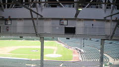
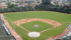
Citizens Bank Park is an excellent, beautiful ballpark (I mean, come on! Look at my background!). And as we found out Monday, it makes a kickass hockey venue, too. Continuing in the festivities, the Adirondack Phantoms (the AHL affiliate of the Flyers) played the Hershey Bears at CBP in what the AHL is calling the “Outdoor Classic” Friday night, a game in which I was glad to take part in. Take a look at a select few of my pictures and tell me that this isn’t a beautiful venue for both baseball and hockey:
Hell of a game that was (4-3 Phantoms win in OT). Hell of a venue, too.
An interesting note about the AHL: I found it interesting that, while the NHL uses colored jerseys at home, AHL teams wear white (or “white,” as it were) at home (or “home,” as it were). As you may know, the NHL designated white as the home jerseys from 1970/71 through the 2002/2003 season (a reversal of precedent, actually; colored sweaters/jerseys were worn at home from ancient history to 1970), and my guess is that the AHL followed suit, but did not followup on the return to colors at home in 2002.
#8: High-cuffed Pants and Stirrups January 8, 2012
Posted by Sean in Beards (and other aesthetics), Burritos (and other awesome things), Sports (and other things relating to sports).Tags: Baseball, legs, socks
add a comment
Baseball is an old-timey game. A relic, if you will. That’s part of the charm of it– baseball is virtually the same as it was when our grandparents’ grandparents saw it, and it will be the same when our grandchildrens’ grandchildren watch it (unless blurnsball takes over by then). Part of the charm of today’s game is when players still dress in that “traditional” look, the high-cuffed pants and stirrupped-socks. There’s no way you can possibly say that this:
looks worse than this:
It’s just not possible. You’re wrong. No offense to Ryan Howard, Manny or David Wright, but that look just isn’t right. It’s interesting that I found that picture of Wright, in fact. If you do a quick Google search for him, there are some images of him with stirrups, and some without (like above). I wish I knew the answer, but perhaps it’s an institution of the new Mets regime? For their sake, I sure hope so. They may play like crap, but at least their legs will look good.
Winter Classic Review (Part II) January 5, 2012
Posted by Sean in Beards (and other aesthetics), Sports (and other things relating to sports).Tags: Hockey, Jerseys, National Hockey League, New York Rangers, NHL Winter Classic
1 comment so far
This is part two of a three-part series about the Winter Classic’s aesthetics. Part I can be found here.
Unlike the home team counterpart, I’m a little disappointed in the Rangers’ duds. Both teams looked really great on the ice, and the orange Flyers looked amazing against the cream/”vintage white” Rangers, despite there being no reason for the Rangers to wear that color. I’ve said it before (I’ll say again), going retro does not mean vintage white, and vintage white does not mean retro. I hate that trend, it’s become nothing more than a cheap gimmick. Initial grade: C+
These jerseys actually really bug me. A few issues: just like the Flyers, the Rangers didn’t directly draw from any one era, but rather drew inspiration from several. The only problem is, the Rangers are one of the Original Six and have been around since forever (not really; they were founded in 1926). And except for three seasons, the Rangers have had “RANGERS” spelled out in diagonal capital letters across their sweaters. It’s what they’re known for! So why would someone give complete disregard to that and put a new/old crest on the front instead? It doesn’t make any sense. They’re also known for the distinct number design, the block font with the drop shadow, why just abandon the shadow, even if it’s for one game? This was an ill attempt at honoring history, but they look nice. Final grade: C-
Thing I like about this sweater:
- The hemstripes. They’re very American, and if there’s any hockey team that I think of as “America’s Team,” it’s Tex’s Rangers, even if I hate them.
- The shoulder yoke. It provides a nice balance to the waist stripes, and gives the sweater an even feel.
- The yoke stripe. I don’t know of any other sweater that has a striping pattern like that on the shoulders, it makes it unique, and relates back to that balance thing I just talked about.
Things I don’t like about this sweater:
- The crest. The Rangers don’t wear crests. Get rid of it.
- Vintage white. GRRRRRRRRR
- Inconsistent striping. Why are the sleeve stripes blue-white-red-white-blue if the waist and shoulders are blue-white-red?
- No number drop shadow. Except for a little hiccup in the 70s, they have always worn dropshadowed numbers since the 40s. If the point of this sweater was to draw from history, why would they go against history and leave it off…?
- Vintage white. I just hate it so much.
- It’s from New York. Just thought I’d throw that one in there.
Bottom line, this sweater would make a fine fashion jersey, or even a solid alt if there was no claim to be historical. But since this is a Winter Classic sweater where everything is based on history, it’s not very good.
Winter Classic Review (Part I) January 3, 2012
Posted by Sean in Beards (and other aesthetics), Sports (and other things relating to sports).Tags: Hockey, Jerseys, New York Rangers, NHL, NHL Winter Classic, Philadelphia Flyers
1 comment so far
So the Flyers played that Winter Classic thing yesterday. Despite the ending, it was a pretty exciting (and beautiful) game.
In a vacuum, I LOVE the sweaters/jerseys. Both teams looked really great, and the Flyers’ orange really popped off the white of the ice, and played really well against the cream/vintage white of the Rangers. I give them a B-
However, the whole point of the Winter Classic is that it harkens back to days of old, and is supposed to celebrate the heritage of hockey. Reflecting this, the sweaters have usually been directly inspired by previous designs. More times than not, they’ve been combinations of eras, evidenced most clearly by the Penguins’ 2011 threads. But because the Flyers have only been around for about 50 years and basically wear the same design they first wore, the team didn’t have too many styles to choose from. I mean, the design they wore from roughly 1982 to 2007 would have been a good start, but I guess 2007 is too recent to harken back to… With all of that in mind, I still give the Flyers a B-, but a lesser one at that (more 80% than 82%).
Things I like about this sweater:
- The bright orange of the body
- The existing hemstripes
- The keystones behind the Captain’s C/Assistant’s A
- The colored nameplates (I don’t like the ones on the white roadie sweater, but I can’t get enough of it here or the home orange)
- The vintage white (I’m not usually a proponent of using vintage white as a retro gimmick, but it works really well here against the orange)
- The black yoke. It really provides a great focal piece and works well as a contrast to the orange
Things I don’t like about this sweater:
- The hemstripes look unfinished (why are there two, unbalanced stripes? It looks like either the black should be thicker, or there should be another thin black stripe around the bottom)
- The white outline around the back numbers is way too thick. This is also an issue I have with the rest of the Flyers’ set
- Shoelaces. I usually think hockey laces are pretty nifty, but the Flyers have never worn them, why start now?
All in all, I think this made a very good one-off sweater. I’d rather not see it as a regular third, especially since it would create color redundancy with the home sweater (which isn’t always a bad thing, however), but I wouldn’t object if they gave it limited (indoor) ice time.
I <3 Jayson Werth’s Beard May 5, 2010
Posted by Sean in Beards (and other aesthetics), Phillies.tk Archives.Tags: Jayson Werth
add a comment
It’s so awesome. I love it. Don’t you?
P.S. we’re back
Changing Uniforms January 25, 2008
Posted by Sean in Beards (and other aesthetics), Phillies.tk Archives.Tags: Cleveland Indians, Fresno Grizzlies, Huntsville Stars, Kansas City Royals, Lancaster Jet Hawks, Lehigh Valley Iron Pigs, New Hampshire Fisher Cats, Northwest Arkansas Naturals, Philadelphia Phillies, Pulaski Mariners, Quad Cities River Bandits, Reading Phillies, Sacremento River Cats, Tampa Bay Rays, Toronto Blue Jays, Trenton Thunder, Williamsport Crosscutters
4 comments
It seems that everyone is changing the design of their uniforms lately.
==UPDATE==This post is too long for the home page. Click to read it.
New Phillies Uniforms II January 4, 2008
Posted by Sean in Beards (and other aesthetics), Phillies.tk Archives.Tags: Philadelphia Phillies
2 comments
Here it is, ladies and gentlemen. A little bit late, but, nonetheless, here they are: The “block” set of new jerseys for the Philadelphia Phillies. Jerseys and hats are from the same place as last time, so get the link there. I’ll update the logo later, when I’m not so tired.
New Phillies Uniforms Part I January 3, 2008
Posted by Sean in Beards (and other aesthetics), Phillies.tk Archives.Tags: Philadelphia Phillies
3 comments
I felt that the Phillies current uniforms are quite bland. I do not like them. In addition, I was browsing through blogs that tagged “Phillies”, and I came upon this, and he said that the Phils ran out of ideas for uniforms. Go read it. In response to this, I have created two new sets of unis, which I will roll out today and (hopefully) tomorrow. The first set is called “Classic”, because, except for the new alternate, these jerseys look very similar to the current ones. There are not many changes between the current kits and the new ones. The new logo is below. It looked nicer on my computer, which decided to eat it.
 The jersey bases were borrowed from here, and the hats from here. I made this all in Paint, believe it or not. Click to view them.
(more…)


